
After a week of post-show rest, I got back to work last week with a watercolour piece I started last November that’s been calling to me from its lonely, relegated spot on the easel. I was ready to jump back in with brush-in-hand, but first I needed to get reacquainted with my plan for this painting, especially since this piece has some complexity. Through courses and my disastrous attempts without it, I’ve come to learn how valuable planning is in watercolour painting.
In this post, I’m going to take a bit of a departure from my usual and share how my latestwatercolour painting came together. If you aren’t curious about painting processes, by all means, scroll to the bottom to see the finished piece.
The first decision in the planning is to determine the focal point of the piece. I decide on a big leaf and its grapes in the right foreground. Then I start to drawing, lightly and loosely on everything, but the focal point objects.
A big piece of planning before painting is to understand the light and dark values of the subject. Where are the whites, if any? Where are the light, mid and dark values? With a colour photo reference, I’ll use a photography app and make a black and white version. I find a b/w version highlights the value differences more easily than the colour picture. Because lighter colours are not the same as lighter values, and the b/w photo reference will show this. I have a watercolour mentor who has instilled the “know the values first” as part of the planning.

Now that I know where the lights are, I decide that some are not going to be easy to paint around, so these tricky spots will need be masked. In this case, lots of leaf veins and stems. Prior to painting, I applied masking fluid with a nozzle applicator – only several weeks later did I buy a ruling pen which would have given a finer line of masking fluid. Oh well, next time.

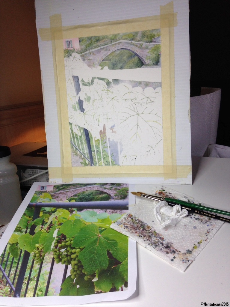
Drawing with masked leaves and stems, wash on mid-background
The next part of the plan is to lay out what to paint first, second, next, and so on. For this piece, I decided to start with the mid-background, the bridge/house/river, because they are a lighter value and would help determine how dark to paint the furthest background of trees and rock embankment. The bridge would get some definition, and the background behind would be mostly shapes of colour with the least definition. The greenery below the fence are close to the foreground leaves and grapes, but I decided to treat them as background with less definition and paint them in the background stage. The dark fence post would then get painted in to determine if the values of the fence background greenery were light enough. During the actual painting, that post showed me that the greenery was painted too dark, so I lifted some paint.
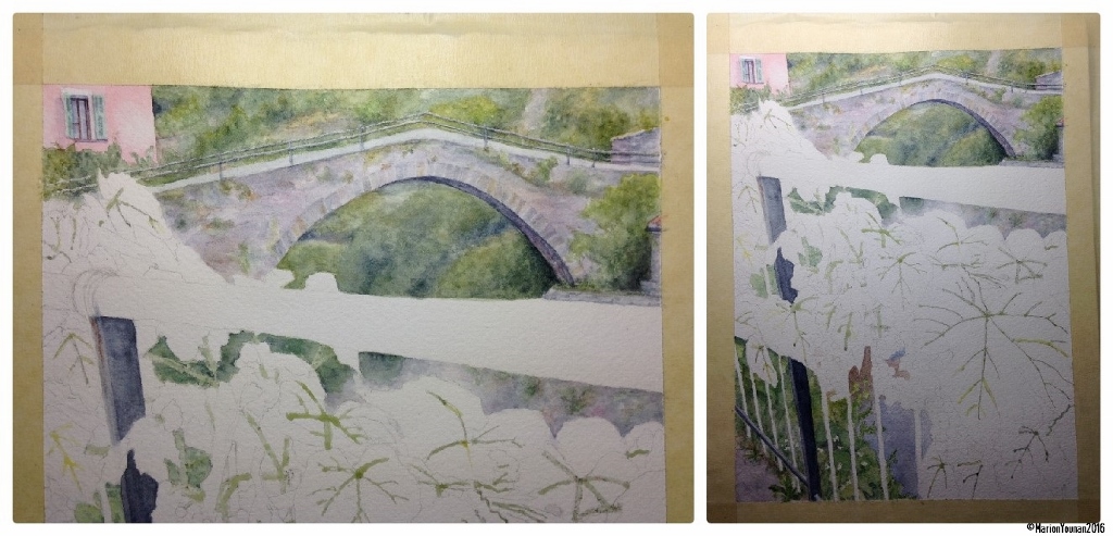
Backgrounds painted in
Now the foreground! I planned to paint in the railing since everything would be painted around it. In consultation with my mentor, it was decided not to paint the railing as dark as in the photo, so as not to distract from the focal point. Next the lightest objects in the foreground would get painted – the grapes. Next the lightest leaves, then the mid-value leaves, the focal point leaf, and lastly the dark ones beneath it. Then the dark posts of the fence. And then the part I can hardly wait to get to – removing the masking fluid, and adding the detail of pink stems and leaf definition.

Getting to some details
Then there’s the “checking” part of the plan, in addition to the continual stepping back from the painting throughout the entire painting process. Towards the end of the painting, I take a photo and a preliminary scan of the piece, because inevitably, I find something that I’ve missed by looking at it. The photo and scan are great at pointing out things that look wonky! Then small adjustments are made. Last decision is where to put my signature – I apply a standard mat to the piece, move it around to the best painting view, and then decide where the signature will go. You’ll see below that the signature is a bit high on the right side because this was the best mat placement.
And finally I’m lucky enough to have a mentor to look over what I think is the last version – she always has great small tweaks that help! Ét voilà!

Grapes of Rocchetta Nervina
About the subject: Rocchetta Nervina is a small town in the mountains northwest of San Remo in Liguria. It’s a destination for summer bathers because a kilometre upstream from the bridge are natural mountain pools in canyons, perfect for cooling off on a very hot Italian afternoon. I took this photo in 2014 specifically as a resource for a possible watercolour painting.
Thanks for following along on this watercolour journey!


Nicely done! It’s beautiful! It must be great to have a mentor.
Hi, Arja: Thanks so much! And yes, I’m very appreciative of the mentoring! She’s gotten me out of several painting binds!
You have a very wise mentor, Marion! Especially where the railing and posts are concerned…less definition, the better. Yet, I would like to see the top railing less pronounced still! Just my two-cents…otherwise, a beautiful, muted, but delightful note of summer. Well done in describing your process. It’s not as easy as we all think, is it! Cheers! 😀
Yes, Janina, it’s always a question with the paint – how much IS enough. I found in this painting that I was removing in one spot, adding in another, removing in another. At a point very late in the night, I just said “basta, basta” because I could have been tweaking forever. Ha ha! Still working on trusting the more quiet voice that says “it’s done”.
Frankly, I would’ve taken artistic licence and removed it completely and hidden it with more leaves!! LOL. But, yes, I do understand about that’s enough…that’s why I do so many repeats! Although I am getting better and more choosy about the number. ;D
Incredible work Marion! I was always curious to know how do you paint and It’s an awesome treat in the morning to see this post. Every step you mentioned in painting planning is very informative. Thank you so much for sharing with us. 🙂
Glad you liked the post, Snehal! After I finished the piece, it was the process to produce it that was staying strongly with me, so the post went in that direction.
Yeah It’s it very helpful 😊
I enjoy the strength of the railing… it is a wonderful composition.
Thanks, Sheryl. I’m in the midst of doing a commission piece with another strong railing in it – seems to be the Year of the Railing so far! LOL