
I’ve painted so many scenes that contain wooden shutters, especially the green ones found everywhere in Italy. In the south of France, those shutters are often a light blue. I’ve often wondered what’s the significance of these colours.
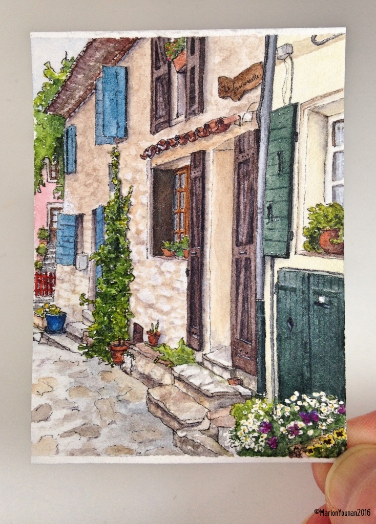
#14 – Provençal Street – sold
This “Mini Vacations” piece comes from a 2008 photo of a side street in the village of Ventabren, a few kilometres west of Aix-en-Provence, France. Our guide on this trip explained that the blue colour was thought to repel insects and animals from entering open windows. She wasn’t sure if there was something in the paint (made from a plant called “woad”) but she’d also heard something about the colour acting as a light reflector. I asked if she thought they worked, and her answer was a shrug. With some research, I discovered that the dark green paint used for shutters in Italy once contained arsenic, so it acted as a repellent, too – in addition to keeping interiors shaded and cool. I liked that this photo had 3 colours of shutters! Today, I imagine it’s hard to move away from those colours because they’ve become so iconic.
I have plans to do a few cards featuring doors in the near future, so get ready for some riveting door trivia – just kidding!


Love the angle, the colors and textures in this. Makes me wanna stare! Thank you.
Thanks, Laura! This scene had lots of interesting elements to paint.
Excellent work! Love everything 🙂
Glad you liked it, Snehal!