
Experimenting with different techniques in my travel journal was also great fun!
Only 3 Colours
I used the Velasquez palette watercolours (ultramarine, yellow ochre, burnt sienna) on this quick sketch… but then realized upon further research that I’d used the wrong blue (Winsor blue)! I painted another sketch with the right blue, but I didn’t like it as much.

Venice Piazza
Splotches of Colour
I painted this really rough sketch with lots of splotches of watercolour pigment, followed by splotches of clean water, and then let the colour spread.
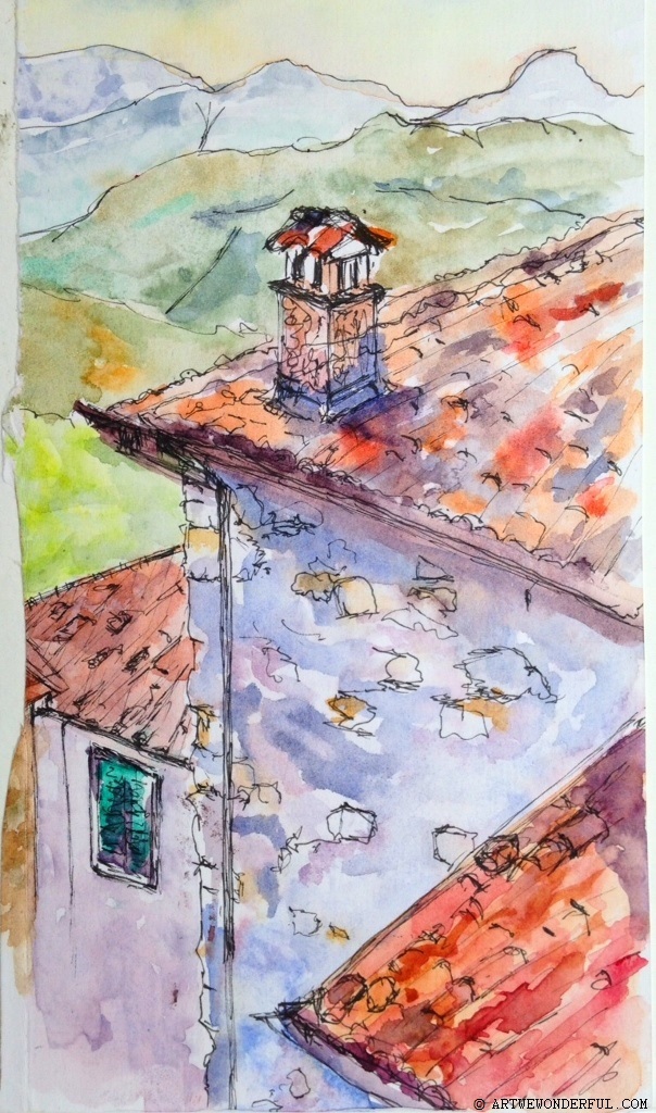
Sommocolonnia
Texture with Tissue
Glued white crinkled tissue paper onto these sketches, and then painted them with watercolour, which brought out some of the texture of these magnificent hills outside the village of Triora in Liguria.
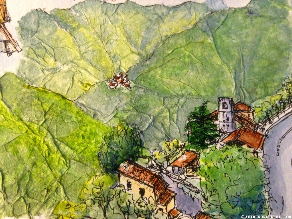
Triora Hills


